Brand Logos Reimagined by Famous Artists – According to AI

From Picasso to Dali, artists have long captured the imagination of the art world and the public at large with their evocative and inspiring works. But what happens when you let them loose to redesign some of the world’s most famous and recognisable brand logos? With a little help from artificial intelligence (AI), it’s now possible to find out.

Famous artists recreating brand logos based on AI image

You’ve probably heard about AI lending a hand on factory floors and hospital wards; it can even help with customer communication software too. But we’re guessing you didn’t know that it can also piece together all-new works of art based on an artist’s previous creation

Well, it can! And that’s precisely what we used it for – redesigning famous brand logos in the style of celebrated artists like Banksy, Monet, Jackson Pollock and even Leonardo da Vinci.

Just picture it: Matisse on Chanel, Monet on Louis Vuitton, and René Magritte on Stella Artois. With AI, it’s possible to turn iconic artists into graphic designers. Anyone’s guess as to whether these world-famous artistes would agree to it or not, but here goes…

So, what did Dali do for Zara? And how might Burberry’s logo look if Banksy got his mitts on it? Let’s find out and take a look at how AI reimagined brand logos by famous artists.
UK

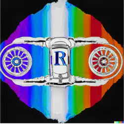
Rolls Royce, in the style of Damien Hirst

Happily, you don’t need to dunk a Rolls Royce in formaldehyde to achieve a Hirstian feel. Instead, his popular spin painting technique is perfect for capturing the cyclical power of a Roller engine.

That said, we doubt the bigwigs at Rolls Royce would be too impressed with Hirst’s modern, out-there take on the classic ‘RR’ logo. For a company built on heritage and prestige, it just doesn’t quite cut the mustard.

rolls-royce designed by damien hirst
burberry logo designed by banksy

Burberry, in the style of Banksy

Given Banksy’s true identity remains a closely guarded secret, it makes sense for them to take the lead on redesigning Burberry’s logo. After all, the brand is renowned for its classic trench coat, worn by many a sleuth and spy over the decades.

But what of the logo itself? Well, we like it. It pairs an urban Banksy feel with beloved Burberry check, with a subtle Union Jack vibe to keep things well and truly British. And as if to illustrate our point, there’s definitely the outline of a mysterious, trench-coat-clad figure in there. Well done, AI.

Spain

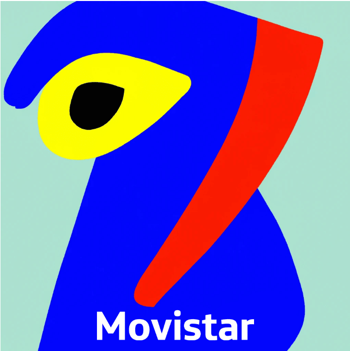
Movistar, in the style of Pablo Picasso

Let’s face it, Movistar’s (Spain’s largest internet provider) current logo isn’t the best, so any redesign would be an improvement. But roping in arguably the world’s greatest-ever artist to do it for you? Few brands could say no to that.

Pablo Picasso’s work is among the most celebrated and highly valued in existence, so Movistar should see its share price go up if they adopt this AI version. The brand’s current logo is a curvy ‘M’ but we’re not sure what this new version is supposed to represent. Of course, if Picasso was still around, he’d probably tell us it was a self-portrait.

Pablo Picasso AI logo
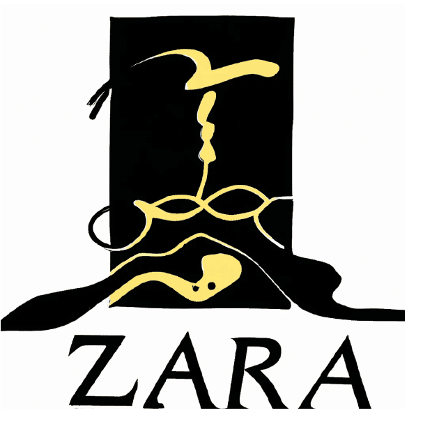
Salvador Dali AI Logo

Zara, in the style of Salvador Dali

Just us or is Zara missing a trick here? Dali’s AI-constructed take on the fashion brand’s logo is chic, eye-catching and on-trend, and exactly the sort of emblem we could picture on a swing tag or two.

Sure, there are no melting clocks or long-legged creatures, but the appearance of Dali’s trademark moustache gives us plenty of clues as to the logo’s origins. So, another success for our AI artist – should we get this copyrighted?

France

Louis Vuitton, in the style of Claude Monet

Louis Vuitton’s logo may be basic and not all that attractive, but we’re not sure the luxury French brand will be rushing to replace it with this AI version in the style of impressionist forefather Claude Monet any time soon.

The AI artist hasn’t quite captured Monet’s subtle and much-celebrated brushstrokes, nor his pioneering use of light, dark and texture. Still, it might be harder to copy than Vuitton’s current logo, which has resulted in their products becoming the most counterfeited of any designer brand in the world.

louis vuitton designed by claude monet
chanel designed by henri matisse

Chanel, in the style of Henri Matisse

Chanel’s mono double ‘C’ logo may be one of the world’s most iconic emblems, but can AI improve it with a Henri Matisse makeover?

We’re not convinced.

Proving once again that turn-of-the-century French art and modern-day graphic design don’t mix, Matisse’s attempt at a new Chanel logo looks more like a child let loose on MS Paint than the crest of the world’s leading fashion house. Fauvist genius or not, we think Coco would be turning in her grave at this one.

US

Starbucks, in the style of Keith Haring

Emerging from the New York City graffiti subculture scene of the 1980s, Keith Haring earned a reputation for his spontaneous and highly stylised works, which often contained messaging related to social activism. Given this background, then, it’s hard to imagine that he’d ever agree to associate his name with coffee conglomerate Starbucks, but we went there anyway.

What do you think? Is it a person reclining with their laptop and enjoying a macchiato? Or a bird with teeth for legs? Either way, we’re not sure Starbucks’ brand managers will be chasing us for the rights to this effort.

starbucks designed by keith haring
apple designed by grant wood

Apple, in the style of Grant Wood

On their release, Grant Wood’s Regionalist works like American Gothic and Sentimental Ballad were considered pioneering for their depiction of ordinary rural life in America’s Midwest. But how is the painter when it comes to graphic design?

As it turns out, not bad. His AI logo may be simple, but we can totally see it appearing on Apple products – particularly if the tech giant ever released a dedicated kids’ line.

Nike, in the style of Jackson Pollock

Nike has never been afraid to push the envelope when it comes to design and marketing, so we could totally have seen this collaboration with the late great Jackson Pollock working out.

Pollock was, of course, regarded for his trademark “drip” technique, which saw him flinging paint at the canvas in a frenetic style. And while our AI version didn’t quite get nail the Pollock aesthetic, it’s a playful and colourful effort that could maybe, just maybe, make it onto a Nike T-shirt.

nike designed by jason pollock

Belgium

Stella Artois, in the style of René Magritte

Belgian realist René Magritte brought us apples and bowler hats, with his work having a huge impact on pop art, minimalist art and conceptual art. It’s no surprise, then, that his art inspired several iconic logos, including that of Apple Corps, a multimedia conglomerate formed by The Beatles.

Though Magritte never worked on any official logos or graphics, we were still interested to get his take on the Stella Artois emblem. And as Belgian beer labels go, we think this one is quite effective.

stella artois designed by rene magritte

Italy

Leonardo da Vinci AI logo

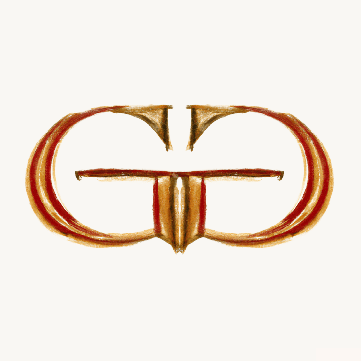
Gucci, in the style of Leonardo da Vinci

Acclaimed Renaissance polymath Leonardo da Vinci could famously turn his hand to anything, so knocking up a logo or two would surely have been well within his wheelhouse. In fact, he probably would have invented AI too if he’d had the time and resources to do so.

As for his AI take on the famous Gucci logo – it’s basic, but effective, with a subtle nod to the artist and brand’s Roman ancestors. Whether it would be fit for use on a Gucci handbag, however, is another matter.

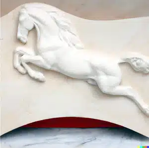
Ferrari, in the style of Michelangelo

Having risen to global fame in his own lifetime (not something many artists achieved), we’re almost certain Michelangelo would have driven a Ferrari. No surprise, then, that we went with him as the artist to reimagine the logo of Italy’s best-loved luxury car brand.

Ferrari’s prancing horse is arguably the world’s most famous brand logo, so giving it a fresh spin is no mean feat. Still, if anyone can give it more pizazz it’s definitely Michelangelo, whose works include the likes of David, Pietà and the ceiling of the Sistine Chapel. Not bad company for a carmaker’s badge.

ferrari designed by michelangelo

Japan

uniqlo designed by hokusai

UNIQLO, in the style of Hokusai

Another collaboration we can actually see working; Edo-period artist Hokusai seems like a good match for the progressive Japanese fashion brand UNIQLO – especially since the brand has featured his work on a fair share of their clothing.

Of course, there was only ever going to be one Hokusai painting that AI featured in UNIQLO’s reimagined logo, and that’s The Great Wave off Kanagawa. Undeniably the artist’s best-known work, it’s become synonymous with Japanese culture, making it a great fit for one of the country’s biggest brand exports.

Nintendo, in the style of Yoshitomo Nara

Yoshitomo Nara’s whimsical, childlike works make him an obvious candidate to reimagine the Nintendo logo, and we’d happily see the whole cast of Nintendo’s household characters drawn up in Nara’s trademark style.

As for this AI version, we’re not convinced the ‘Nintendo’ typeface would make it into print, but Mario sure looks cute. With a few tweaks here and there, it could be an effective collab.

nintendo designed by yoshitomo nara

Switzerland

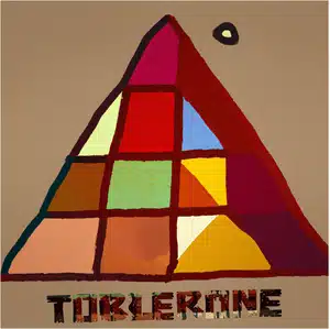
toblerone designed by paul klee

Toblerone, in the style of Paul Klee

Expressionism, cubism, surrealism – Paul Klee mastered a whole range of artistic styles during his lifetime, and his notebooks had a comparable impact on modern art to that of Leonardo da Vinci during the Renaissance. Question is, is he any good at logos?

As it happens, yes, Klee can turn his hand to a logo – even if it was drawn up by AI. Klee’s reimagined Toblerone logo is modern and understated, while still featuring that all-important pyramid that has become synonymous with Switzerland’s favourite chocolate.

Nestle, in the style of Max Bill

Like many of his contemporaries, Swiss-born artist Max Bill was something of a jack of all trades when it came to creative endeavours. He was an architect, artist, painter, typeface designer and graphic designer, making him the perfect candidate to redesign the logo of one of Switzerland’s biggest brands: Nestle.

Our AI version may look simple, but it has some of the hallmarks that made Bill such a prolific designer: lots of angles, contrasting colours, and a mixture of straight and curved lines that instantly grab your attention.

nestle designed by max bill

Well, what do you think – could AI technology replace artists in the future? Or at least help brands design better logos?

We hope you’ve enjoyed this tongue-in-cheek look at brand logos reimagined by famous artists. At Gnatta, we harness the power of AI and automation to augment our customer communication tools, giving you more ways to connect with your users. To learn more, get in touch.

Discover More With Gnatta.

Get access to free expert insight, exclusive CS events, and the best offers. Only available through our newsletter.